“Color is a power which directly influences the soul.” – Wassily Kandinsky
Color is more than just something we see, it’s something we feel. It is incredible how a simple color can affect our mood, spark memories, or even inspire creativity. Have you ever entered a room and immediately felt relaxed by gentle blues or energized by bold reds? SAME! We have too. Now you must be wondering how this question connects to color and branding in a website. Well, your website is the digital room of your brick and mortar store. Therefore, it is crucial for your website to have colors had have a strong connection with your brand’s value.
Remember, if your colors does not represent the core your brand, it will not connect with your target audience and will leave you wondering where it all went wrong. But, don’t you worry we are here to provide you with ultimate color and branding guide for your business website.
Understanding Color Theory
Let’s begin by understanding the color theory as it the most important step in creating impactful color palettes for websites and brands. Color theory is a set of fundamental principles that rule how to create pleasant color combinations.
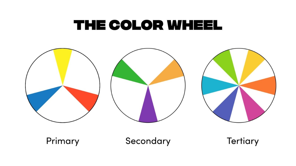
Primary Colors
Red, yellow, and blue are the three primary colors and when you combine these colors secondary colors are formed.
Secondary Colors
The secondary colors are orange (yellow + red), green (yellow + blue), and purple (red + blue). Now, if you mix these colors with primary colors create tertiary colors.
Tertiary Colors
These colors are the blend of secondary and primary colors (such as, blue – green, yellow – orange, red – purple, etc.)
Shades,Tints, and Tones
Primary, secondary, and tertiary colors in the color psychology chart are considered pure colors. They are cheerful, vivid, and saturated. Shades are created by adding black to the pure colors. Meanwhile, tints are blend of white to pure colors. This creates less intense and lighter colors. Finally, combining black or white with a pure color produces different tones.

Now that you know how various colors are arranged and formed on the mighty color wheel, it will be convenient to create captivating color palettes.
Using Contrast
Another essential color theory principle highlights the use of contrast. In the color psychology chart, the higher the contrast, the more colors will stand out from one another. When assessing color contrast, it’s essential to consider not only the colors themselves but also their tones.
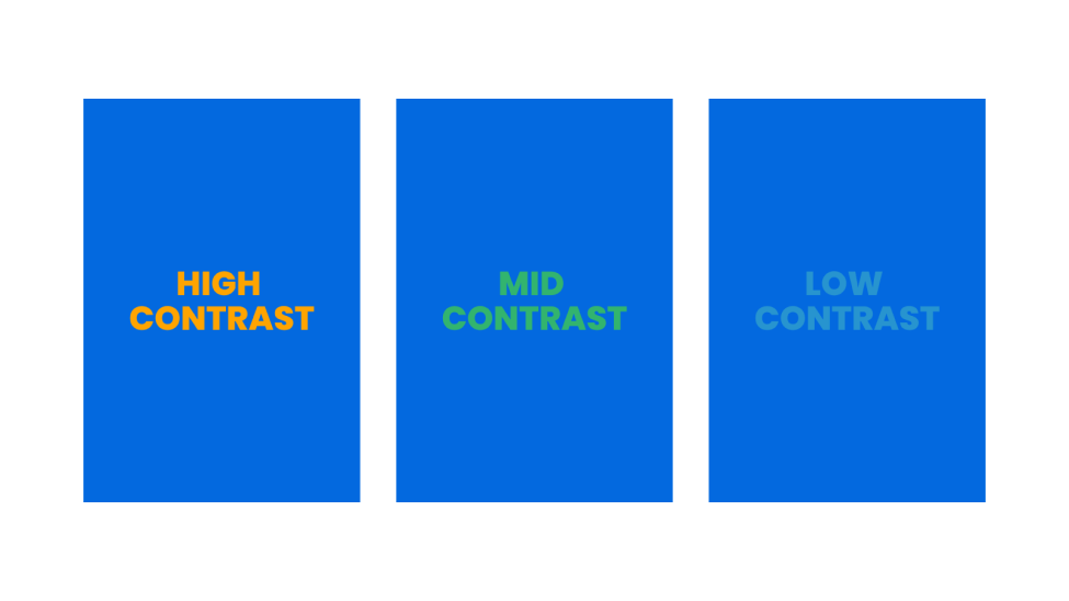
Usually, we want to utilize colors with high color contrast in web design as it creates greater legibility. For example, if the background is dark then you would want to add the text in white, or vice versa. Remember, overdoing anything will ruin it. Therefore, make sure that you use a good balance of contrast throughout the website.
Using Color Psychology Chart To Deliver Brand Values
The color psychology refers to the strong influence of colors on our feelings, behaviors, and emotions. Even though it is a bit subjective, color psychology can instantly help us subconsciously influence people who visit our website in significant ways. Hence, this makes color a very powerful tool for marketing and design.
Colors Evoke Emotions
People are drawn to particular colors because of how they make them feel. On the contrary, colors can also be the reason behind a gut reaction that would lead someone to avoiding connecting or associating with them. If it is difficult for you to comprehend, it is because we are missing a major piece of the puzzle: context. In a certain context, red might stir a feeling of anxiety and fear. On the contrary, it could also ignite passion and excitement.
If you’re willing to use strong color and branding in your website that delivers strong emotion, it should complement other elements on the page, such as imagery, copy, and typography. With that caveat in mind, let’s go through some common associations between emotions and color.
Common Color Associations
The below shared color associations can easily be used as a reference color psychology chart as you consider which color would best represent a specific brand/product. Before choosing a brand color ask yourself these questions; how shall my target audience feel when they visit my website? What actions do I want them to take? Once you get the answer to these questions, you are good to go. Remember, with the right context, color can make a huge difference between a disinterested visitor and an engaged potential customer.
Blue: trust, calm, peace, competence, reliability, logic.
Red: Power, passion, love, danger, excitement.
Green: nature, abundance, nature, health, prosperity.
Yellow: optimism, creativity, friendliness, happiness.
Purple: creativity, loyalty, mystery, luxury, sophistication.
Pink: sincerity, gentleness, nurturing, warmth.
Brown: power, control, elegance, sophistication, depression.
White: peace, clarity, cleanliness, purity.
Types Of Color Palette
If we talk about types of color palettes then there are five main types:
Monochromatic
Triad
Analogous
Complementary
Spilt complementary
Any of these color palettes can easily be used to design an effective color palette for a website. We have shared a few examples of how each of these color palette types are employed in web design.
Monochromatic
A single color paired with different tints and shades is the base of monochromatic color palettes. Monochromatic palettes are highly pleasing and soothing to look at. In website design, adding a complementary color to a monochromatic palette is an effective way to draw attention to key elements for the audience.
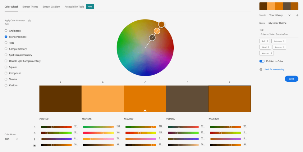
Monochromatic colors usually involve brightness variation.

Triad
This beautiful color palette consists of three colors that are equally spaced apart on the color wheel, creating a triangle. This type of color palette is a little risky to use in a website design as it can appear to be unclean and noisy. As mentioned earlier, it all depends on your context, triad color palettes can be highly effective for playful, artistic, and/or youthful brands.
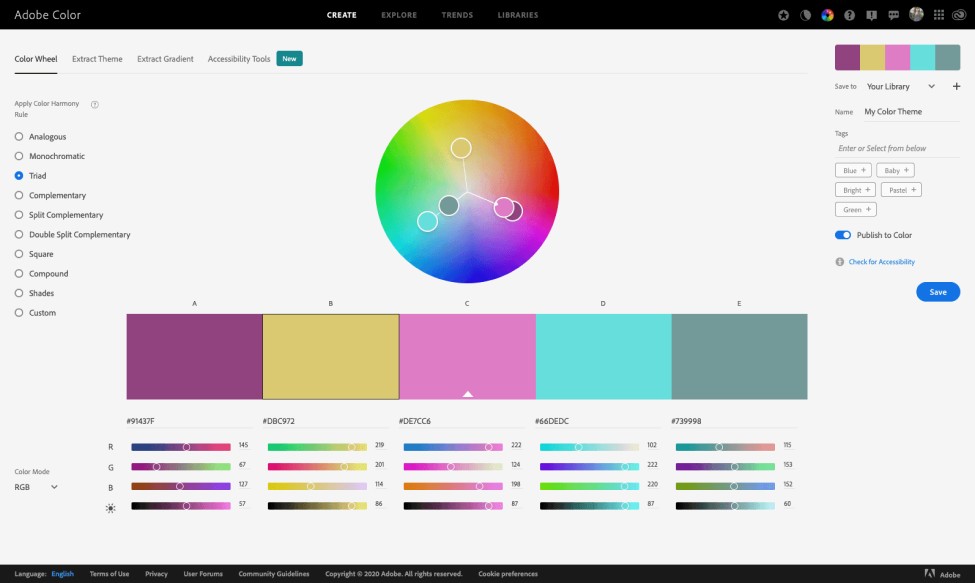
Triadic colors are positioned at equal intervals on the color wheel.

Analogous
The colors od this palette are always sitting next to each other on the color wheel. This type of color palette can be very captivating as the colors fit together like a missing puzzle piece. Nonetheless, the effect of these colors can be too subtle, preventing any element from standing out.
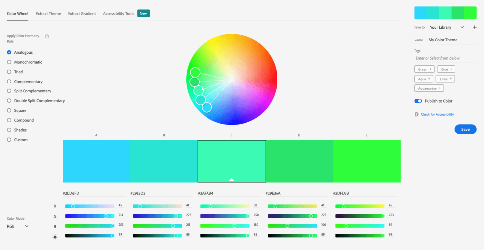
Analogous colors sit very close to one another on the color wheel.
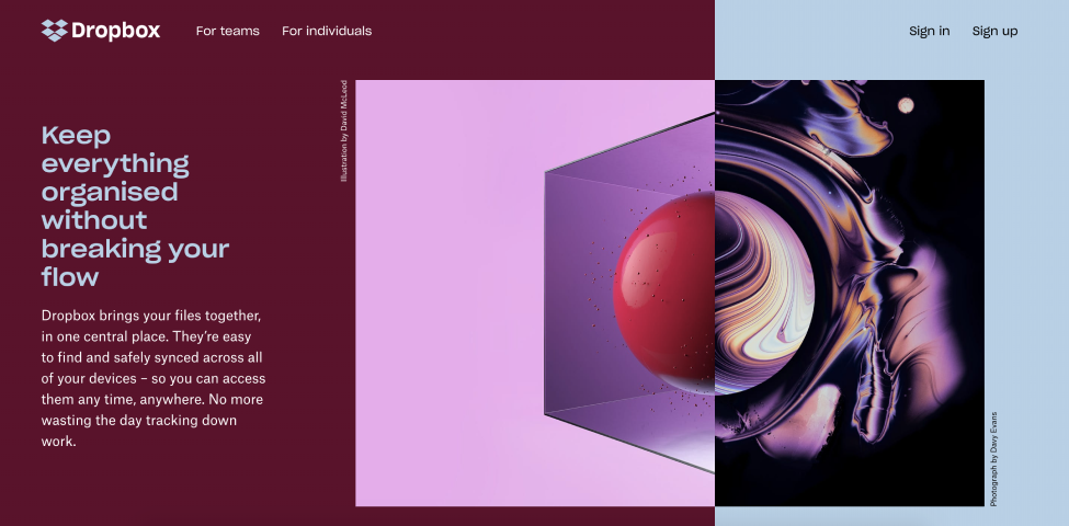
Complementary
This breathtaking color palette contain colors on opposite ends of the color wheel. These color palettes are highly effective in website design, as they create a sense of visual balance and dynamic tension. If the colors are used in a balanced proportion the tension can be too high. It is suggested that you pick one of the complementary colors as the main/primary brand color and then use the other color as an accent.
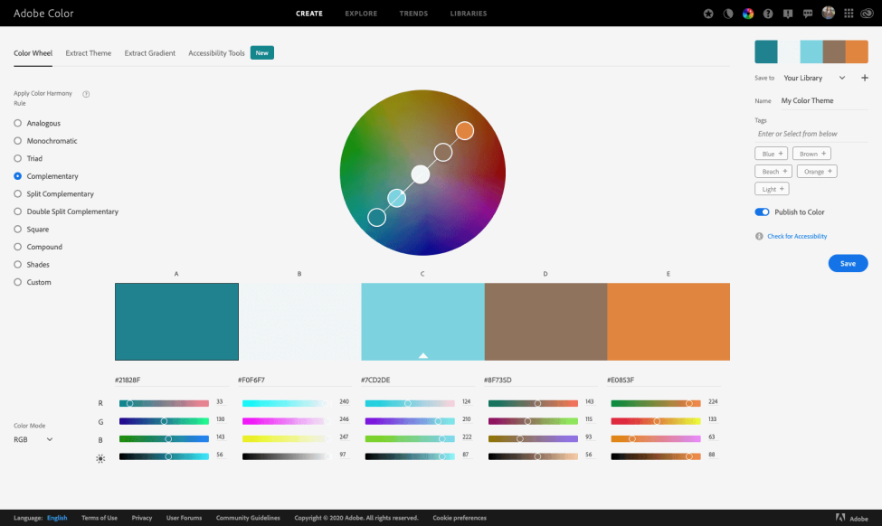
Complimentary colors are placed opposite to one another in color wheel.

Split Complementary
Split complementary color palettes are similar to complementary palettes but with a twist of third color placed to the complementary colors on the wheel. This type of color palette is also very effective in website design and can add even more visual excitement for the users without creating too much noise.
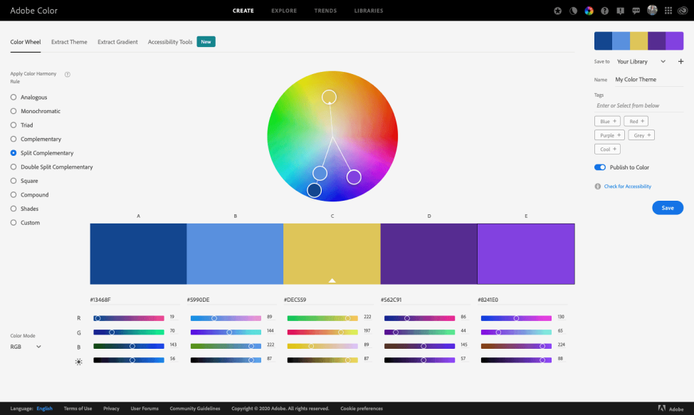
Top leading brands use this unique color combination.

How To Use Color Palettes Effectively In Web Design
There are different online tools you can utilize to simplify the process of creating chic and effective color palettes and master the color psychology chart. One of the top used tools by designers is Adobe Color, with this tool you can easily play around with colors to create a personalized palette with any of the five color types mentioned above. You can also upload an image to extract colors from, or you can click on the Explore tab to peruse pages and pages of color palettes.
Start by selecting three colors for your palette: a primary color, a secondary color, and an accent color. Then, you can employ 60/30/10 rule to these colors. As per this rule, 60% of the color on your business website should be the main color, 30% the secondary color, and remaining 10% the accent color. Don’t forget, black and white count as colors, too.
Final Words
As per the color psychology chart, color theory is one of the most crucial, and usually overlooked, concepts in the website design. Color theory is a very powerful tool. Choosing the right color combinations can evoke emotions, build trust, enhance brand recognition, and support website growth . On the other hand, mismatched color combinations can create distrust, build anxiety, and turn your visitors away.
Therefore, understanding how to use color theory to your benefit is one of the essential concepts every website designer should know.
WEBNFLIX Wishes You Well For Your Next Design!


